some UX bugs
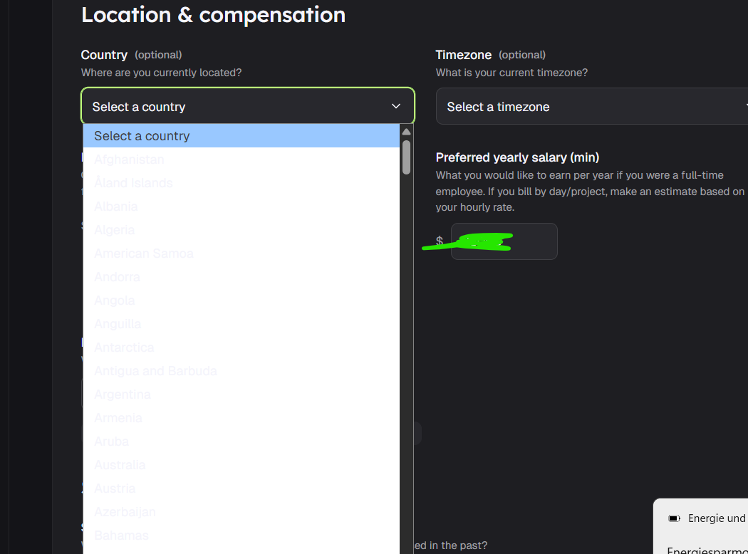
so in the dark mode the drop-down is unreadable
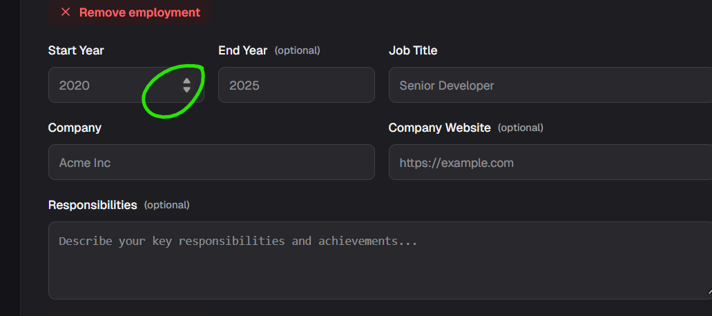
When I pick the year of employment I assume that the pre-filled data starts with 2020 → I click on the arrows and it takes me back to 1951
Also, add more none technical skills e.g. for QAs
Log in to comment and vote
Comments4
Joaquim carlos Timóteo
May 21
Amor
Olena Gulina
Mar 17
1. I use windows 11; chrome Version 145.0.7632.160 (Official Build) (64-bit)
2. yeah, get that, that is why for me it was user experience; it is just confusing and annoying
I forget it goes to 1951 and i have delete and manually enter
3. even technical so filter: Testing documentation; Regression testing; Test Design or in general just add Manual QA
Mostly the skills part contains languages, and some of us work without using them and it is hard to filter
Michal Ševčík
Mar 17
Ad 1) What OS are you on? I tried both dark / light modes on Chrome / Safari on Mac and cannot reproduce.
Ad 2) I looked into this and it’s a standard browser behaviour for numeric inputs. The 2020 is just a placeholder, i.e. an example value, not a starting value. The min value is set to 1950 so pressing arrow up goes to 1951.
Ad 3) Can you elaborate on “more none technical skills e.g. for QAs”? Some examples of what you mean?
Michal Ševčík
Mar 17
Good catches, thanks for spotting these. I’ll fix them soon!